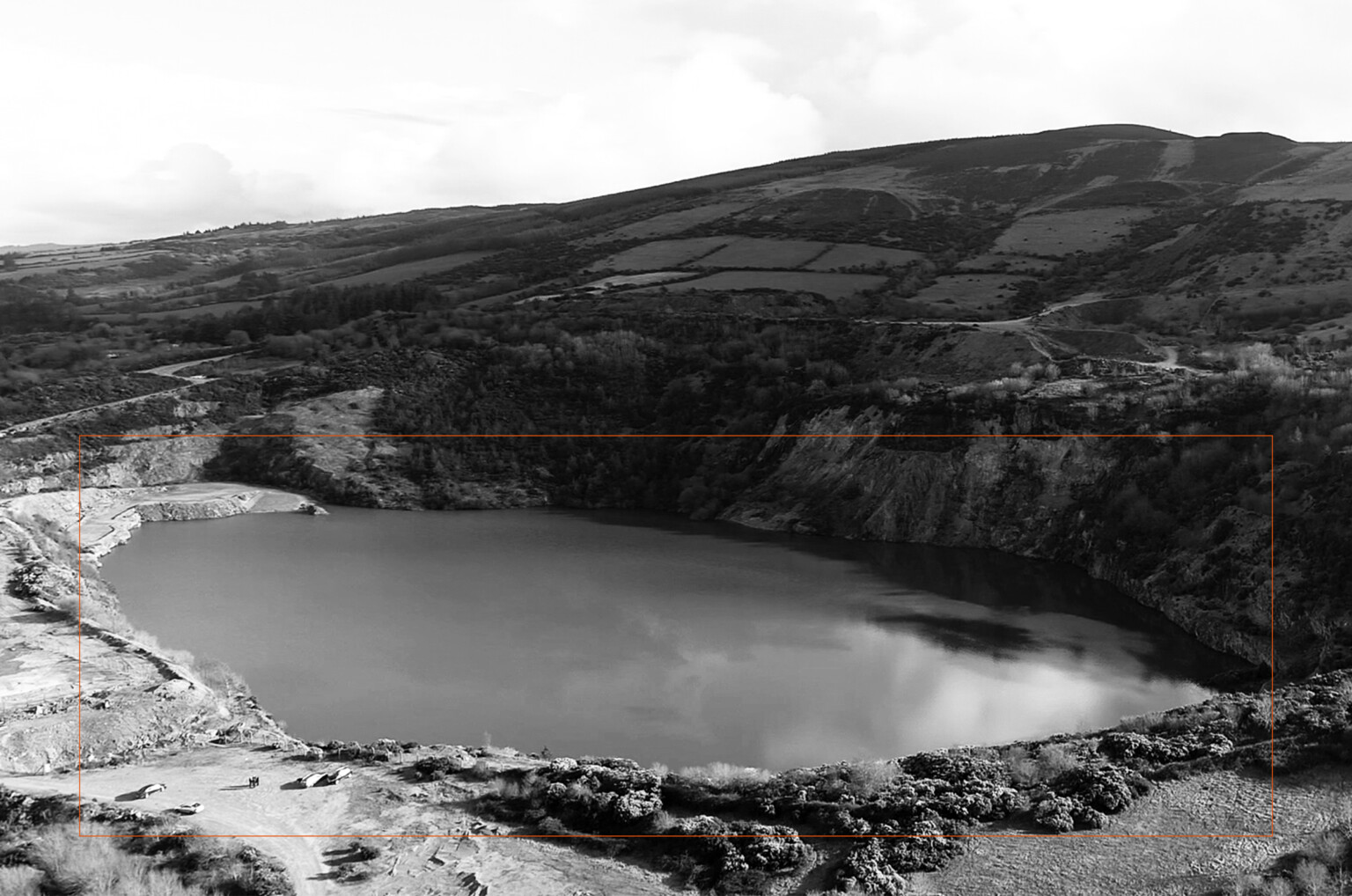
We crafted a brand and tone of voice to support Silvermines emerge into its new role as Silvermines Hydro a hydroelectric power station that will transform the former mining site into one of Ireland’s leading green energy facilities.
As a designated European Project of Common Interest (PCI), this infrastructure project required a brand that reflected its purpose and ambition for a cleaner future.
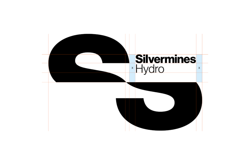
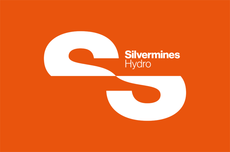
We realised a unique logomark by splitting the letter 'S' horizontally and offsetting the shapes, this mark visually references the 2 integral water sources one high and one low required for hydro power. The resulting curves allude to the flow from one body of water towards the other.